
Client: Lidskae pivo
Brand: AURA
Tasks: Label redesign
AURA Artesian Water is one of the quickly growing Belorussian drinking water brands.
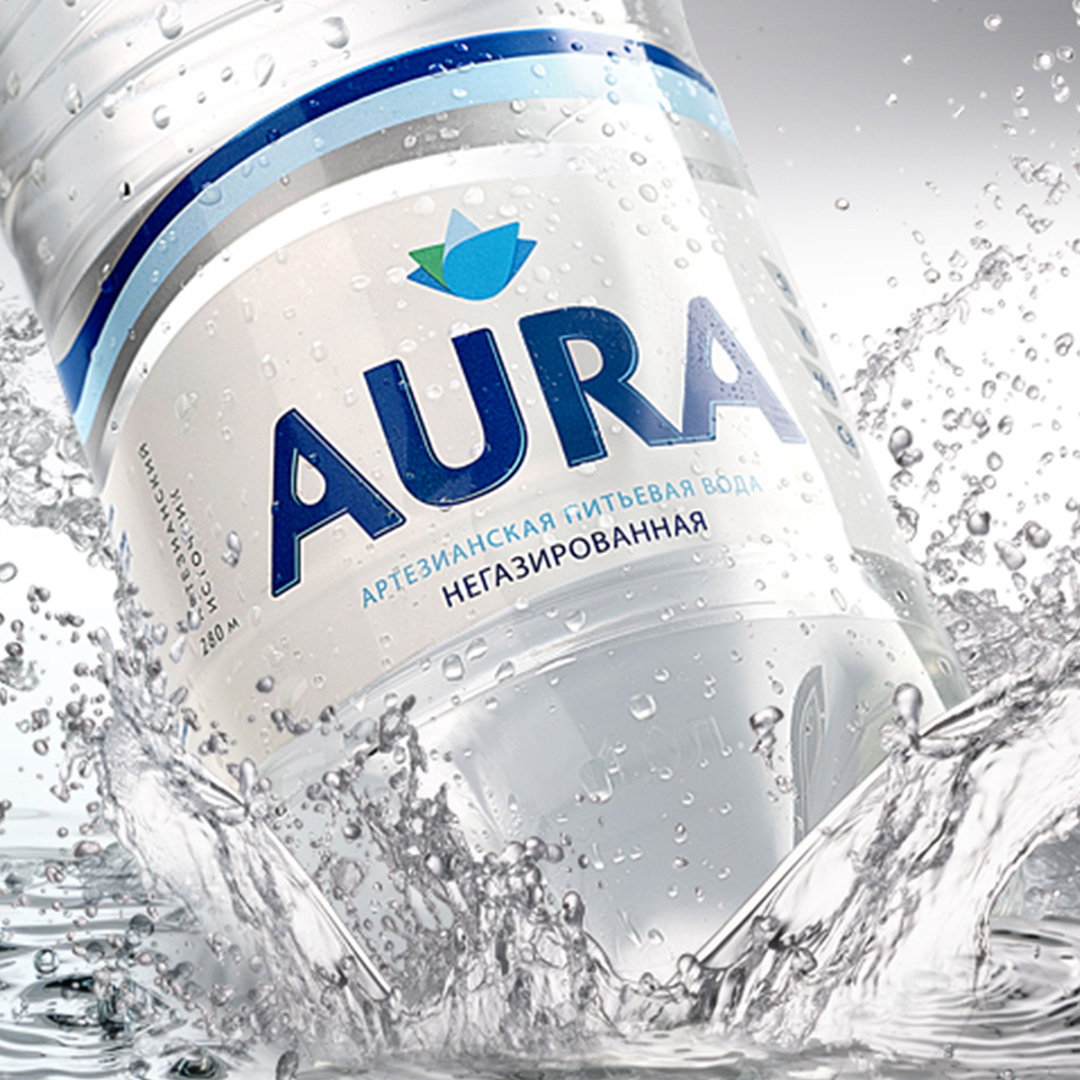
The new design of AURA Artesian water goes back to the essence; it’s iconic, without fuss, elegant, yet accessible, with a purely natural design.
Water is progressively commoditizing in an increasingly crowded competitive landscape worldwide and Belarus. We needed to create a solution that stands out from the “sea of sameness” avoiding category clichés.
The target consumers are young adults, who are active and optimistic. The task was to create a single, proprietary visual identity system that would work across the whole portfolio and be flexible enough to work in different formats, from packaging to point-of-sale marketing, to outdoor advertising.
The new design needed to reflect the brand’s adjusted active and uplifting positioning and is based on three design principles:
The new visual identity system was first launched in Belarus at the beginning of 2018. Results exceeded expectations and product sales increased by 50% within 6 months following the launch. The lotus flower and wave identity are becoming an iconic signature for the brand, generating higher brand awareness.
