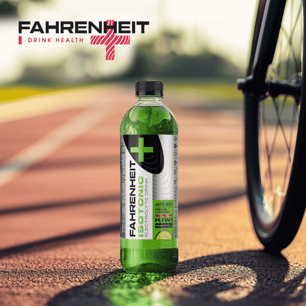
FAHRENHEIT Isotonic is the latest addition to the FAHRENHEIT range of functional beverages — an isotonic drink designed to support hydration and electrolyte balance.
The Dutch Design House team developed the packaging to visually communicate the product’s key benefits while preserving continuity with the existing FAHRENHEIT identity.
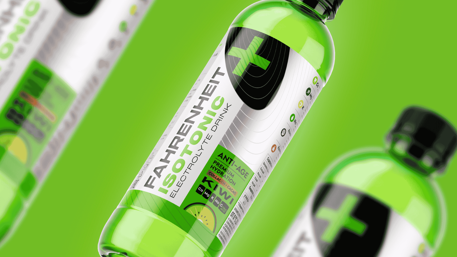
Maintaining brand recognition was essential, but the new SKU also called for distinct visual cues. One of the key design choices was the addition of silver accents — a reference to energy, precision, and functionality.
We also highlighted the presence of vitamins and collagen — elements that set this product apart within the range — through clean, clear design elements that reinforce its functional positioning.
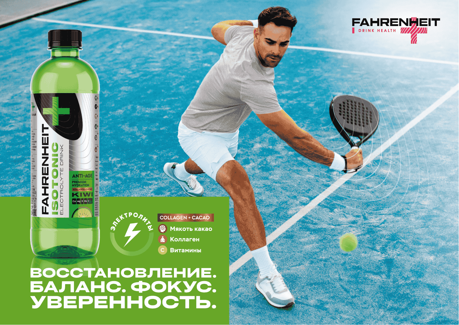
To support the launch, we created a key visual that emphasizes the drink’s functional qualities and strengthens brand communication across every consumer touchpoint.